Dark mode designs are becoming popular everywhere on the web. We have all tried dark mode on our mobiles.
It is not possible to resist it, is it? Imagine that your sleep gets disrupted during the night. What is the first thing you are likely to do?
Switch on your mobile screen, most probably. Surely you would prefer a darker screen rather than a bright white beam blinding your pupils.
However, it is not about working in the dark only. You might call it just a color scheme, but it is the most popular style in UI/UX designing, trending in 2021 too. Why?
Take a look at these nutty snippets:
- There is a huge demand for dark mode readership
- It is easy on the eyes
- It saves battery on mobile devices
- Coders are all for it
- Adapts to user’s mood
- It is catchy, trending, and looks cool
We will discuss the above points in detail, but first things first.
Table of Contents
What is the Dark Mode?
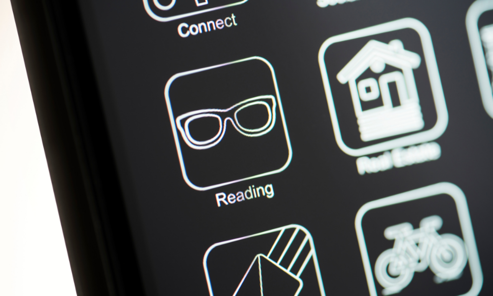
Dark mode, is an inversion style of the user interface (UI), with a greyish black backdrop.
In the normal mode, when one opens a browser, one usually sees a large white window with text in a deep color,(usually black).
In this user interface, the windows are black or grey with white or greyish text. Popular social platforms such as Twitter Instagram and the app facebook are also offering such themes.
Let us take a look at the reasons why this trend in web designs is catching on.
How has Dark Mode become a Trend?
As we know it, the digital world keeps changing rapidly. In a developing economy, businesses face several challenges.
Now more than ever, a digital presence has become not only important but essential for varied business processes. To ascertain an online presence, marketers have to take web design trends into account as well.
There are certain trends in web designing that have caught the eyes of Digital marketers. It is the Dark Mode Designing.
Various popular and favorite web applications such as Chrome, Slack, Microsoft Office and Facebook( to name a few) have gone dark in the last year.
More and more websites are ready to jump the wagon. Greyish black backgrounds enrich a website by popping up certain design elements with a better color and contrast ratio.
Of course, it is not followed blindly for every app or site. Web designers and marketers such as OIS can evaluate its viability with your brand and implement a unique creation for a high return on investment.
There is a Huge Demand for Dark Mode Viewership
The dark mode is in vogue in web designs. It is being considered a good marketing fad too. The soothing & attractive display plays on people’s emotions and can persuade them to buy a product.
Color theme influences customers to react in a certain way to your offers – or reject them entirely. For a business website, if you want to improve your conversion rate, all elements in the UI of a landing page work together, including the color
schemes. For example, users are more likely to remember an attractive dark theme page than a white sheet like Wikipedia.
It is easy on the eyes
The dark mode is also trending because it reduces strain on the eyes. A low-light environment provides a pleasant experience of readership on the web. It enhances visibility for people with low vision, or light sensitivity.
Phone usage is increasing day by day, for all age groups. Assessing that users spend 6-10 hours every day in front of a screen,
Changing to an inversion theme can reduce the occurrence of dry and tired eyes and headaches considerably.
There is also the theory that brighter screens disrupt sleep. Switch the mode in your settings and curb your insomnia.
Were the night mode to reduce eye strain, and enhance readability, we can understand the positive impact on our health and tech usage.
It Saves Battery on Mobile Devices
Without a dark mode, all the empty white area on your phone’s screen needs more power, which uses more of your device’s battery.
Especially in iPhone, battery drain is faster, as it increases with screen time. The battery lasts longer if you reverse the mode in your device.
The same goes for Android phones too. By switching to the inversion theme, the time interval between charging is bigger.
Coders benefit from dark theme
The dark mode is very popular with web developers. Software developers spend a substantial amount of screen time in coding.
A warm screen helps them focus better and write codes easily with white text on a black or grey background.
Also, as user tendencies are switching, web designers are bringing innovation in UI, owing to user preferences. From text to graphics and logos, designing is being done to merge agreeably with darkish themes.
Dark Mode is catchy, cool, and adaptable to mood
The web world is an exciting place where people go crazy over simple changes in UI. The same goes for color inversion.
Even though the processes remain the same, the user experience gets enhanced. Think of Facebook or Gmail in a dark mode.
It looks cool and catchy, does it not? Just as our moods are different at different times, we feel the need for a fresh visual experience on our devices as well.
Dark mode UI creates a feeling of high status, luxury, and affluence. If your product or service falls in that category, go for it. an be an effective tool.
For certain products, the deeper color theme proves to be catchy and engages customers. It is simply about being cool and trendy.
It is here to stay
Leading websites, Apps, e-commerce stores, fashion graphics, and social platforms are implementing dark themes. Users are loving it and graphics designers are building innovations in it.
It is trending and will continue to do so.
I have a green thumb - I love to do gardening and am also into organic farming. Other than that I simply love traveling and networking with people. I spent 13+ years living in North America and have traveled extensively around the globe with global business interests.


